Editorial Furniture Poster
- Model
- GPT Image 2
- Image
- 1024 × 1024 px
Prompt
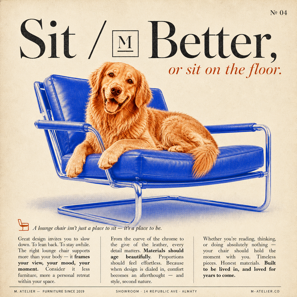
Vertical editorial poster designed like a premium furniture magazine spread with a refined Cereal, Kinfolk, Apartamento, and Dwell-inspired aesthetic. The composition uses a warm cream paper-textured background with subtle grain, faint halftone dots, and tactile printed-magazine realism. In the top-right corner, a small serif page number reads “№ 04”. At the top of the poster, a large elegant high-contrast serif headline reads “Sit / Better.” in deep charcoal-black typography. A minimalist square monogram badge is embedded inline before the word “Better,” matching the x-height of the serif lettering. Beneath it, a smaller italic serif sub-headline in warm rust-orange reads “or sit on the floor.” slightly offset to the right with playful editorial balance. The center of the poster features a dominant duotone photographic collage composition. A relaxed subject lounges comfortably on a modern Bauhaus-inspired cantilever lounge chair with chromed tubular steel framing and leather cushions. The chair is rendered entirely in bold cobalt-blue duotone while the subject appears in warm rust-orange and copper tones, creating a playful two-color silkscreen effect. The subject has a calm relaxed posture with subtle editorial attitude, naturally interacting with the chair as the focal design object. Both elements overlap naturally with visible halftone print texture, soft paper shadows, and tactile magazine-print realism. The bottom third contains a refined three-column editorial body text layout in justified serif typography. Above the columns sits a small italic serif introduction line with a minimalist chair glyph introducing commentary about the lounge chair. The columns contain elegant editorial-style furniture copy with occasional bold emphasis throughout, mimicking premium interior-design magazine layouts. At the bottom edge, a thin footer strip displays small uppercase sans-serif metadata text: “M. ATELIER — FURNITURE SINCE 2019” on the left, “SHOWROOM · 14 REPUBLIC AVE · ALMATY” centered, and “M-ATELIER.CO” aligned right. Palette consists of warm cream paper tones, cobalt-blue duotone (#2E5BFF), rust-orange accents (#D1623A), and deep charcoal-black typography. Elegant serif typography, tactile print grain, halftone textures, soft cast shadows, clean editorial hierarchy, and sophisticated magazine composition create a playful yet luxurious design-object aesthetic. Awwwards-quality editorial poster, Behance presentation style, ultra-detailed 4K vertical print composition.
Any aspect ratio
Overview
The Editorial Furniture Poster template leverages the capabilities of the AI Image Editor, utilizing the sophisticated gpt-image-2 model. With a clear nod to premium furniture magazines like Cereal and Kinfolk, this template offers creators the tools to design visually arresting posters showcasing high-end editorial aesthetics.
What It Does
This template is designed for crafting editorial-style posters characterized by tactile printed-magazine realism. It incorporates advanced features such as halftone textures and paper shadows, all laid out in a balanced, compelling design. The central theme focuses on showcasing furniture pieces within sophisticated magazine compositions that draw on luxury design-object aesthetics.
Who It's For
Ideal for interior designers, furniture marketers, and creative agencies, this template is for anyone aiming to produce high-quality visual content that reflects the elegance and sophistication of premium furniture spreads. It offers a practical solution for those in the editorial and commercial design sectors, looking to enhance their presentation materials or ecommerce ads.
Summary
With the Editorial Furniture Poster template, users can create posters that perfectly mimic the luxurious style of a high-end interior design magazine. It combines modern design elements with extreme attention to detail, providing not just a design tool but a comprehensive solution for mood boards and marketing campaigns within the furniture industry.
How to Use
Choose Your Template

Customize Your Design

Generate Your Poster

Use Cases
High-End Furniture Marketing
- Luxury furniture ads
- Showroom event promotions
Interior Design Presentations
- Client proposals
- Portfolio pieces
Editorial Features
- Furniture feature articles
- Lifestyle magazines
Best Practices
Maintain Visual Hierarchy
Ensure your headline, subheadings, and body text follow a logical hierarchy to guide the viewer's eye effectively.Play with Texture and Shadows
Utilize the tactile print grain and paper shadows to add depth and realism, making sure these elements align with the overall aesthetic.Focus on Color Balance
Balance the warm rust-orange tones against the bold cobalt-blue for a harmonious and striking finish.